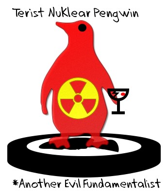
I think this was the original logo for this site. It has so many layers of hidden messages inside of it…
- how the words “terrorist” & evil are misused to label anything that challenges our current social hierarchy
- how we all behave badly sometimes (even the penguins on Antartica)
- the outsized sense of importance of trivial things when stuff goes bad & how self-aggrandizement can make us feel more important than we are
- how people put their best face forward, but always have something in the background they hide / would rather not share
- the fear people have of nuclear power & the unknown in general, even while we willfully poison ourselves daily with things like alcohol & sugar
I think that logo took about 5 minutes with AAA logo…years later I still love it & haven’t had a personal logo I liked as much since.

This was a quick design making a mockery of how self absorbed many blogs (including this one) are. I later archived the content onto a different domain & decided to start from scratch as a bland unbranded blog.
I think using the default design made me bored of it & I sort of stopped working on it. Since I posted about my dad’s American Legion site & hadn’t posted for years I thought it would be a great time to update to a logo that infused Steven Cobert styled patriotism & SEO. 🙂

As the worldwide economy has been melting down I have been reading a lot more broadly about the world & some of my interests don’t entirely fit in the tight niche of SEO, so I figured I may as well convert the site to WordPress (since I am more familiar with it & won’t have to bug our programmer about it if/when anything messes up) and put a new masthead on it. The current one is a play on the Panda update, where the widget bit was a $15 iStockphoto image & then I put some ugly text next to it. Though if I blog here regularly I will likely end up changing the masthead fairly regularly.

I do realize the font is sort of jacked. I could do it in Photoshop at some point if inspirations strikes. Sometimes leaving things a bit rough is better though, as it shows more character. 😉
